If you run a company or brand website, you should implement a responsive web design for several reasons. Keep in mind that Google’s SEO guidelines are continually changing. Recently, they have shifted their focus away from traditional SEO factors and toward rating pages that provide the best user experience possible.
Google has remained rather quiet about the specifics of its ranking algorithms, but the search giant has made clear that it considers responsive web design to be a ranking factor. As one might expect, designers and marketers put in extra effort to guarantee a mobile-friendly and aesthetically pleasing layout. This changes the game and benefits those who put in the effort to create high-quality websites that are useful to site users and appreciate their time. Seven of the most important search engine optimization (SEO) gains from switching to a responsive design are listed below.
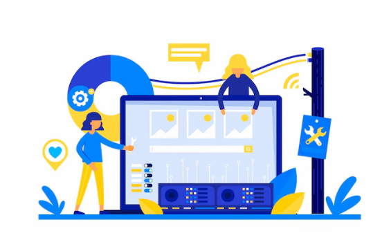
What Does Responsive Web Design Entail, & Why Is It Necessary?
The term “responsive web design” refers to tailoring a website to the device and browser through which the user can easily browse the website. This means easily it will adapt to the display’s dimensions, the screen’s orientation, and the type of device being used to see it. For this reason, “mobile-friendly” and “responsive web design” are sometimes used interchangeably: mobile-optimized sites are built with flexibility in mind from the start.
Also, a responsive design prioritizes the visitor’s experience. Don’t lose sight of Google’s web core guidelines, which specify how a website must respond when accessed by a user. A responsive website automatically adjusts its layout based on the device used to access it, meaning that everything (text, photos, checkboxes, buttons, etc.) loads quickly and in the correct location. Prioritizing a responsive website design will improve your search engine rankings, lead generation, and conversion rates.
SEO Benefits of Responsive Web Design
1. Google Gives Mobile Top Priority
Google prioritizes user experience by designing for mobile devices. This is so that consumers can easily access and engage with Google’s high-quality content. With more and more people using their phones to conduct online research, it’s more important than ever that websites provide a consistent experience regardless of the device being used. Google’s ranking algorithm places a premium on user-friendly sites, and responsive design is a key part of that. Putting money into a responsive design helps with search engine optimization.
2. A Faster Rate of Loading
A page’s loading time is a major ranking factor for search engines. The patience of your visitors depends on how quickly your site loads. Customers who shop online are notoriously irritable, and even a brief delay might cause them to abandon a purchase. A responsive web design eliminates this issue by shifting page loads on mobile and desktop computers. Consequently, your site’s visitors and the search engines will be satisfied.
3. Better for the Customer
Consumers will be more satisfied with your product if it is easier to use, and satisfied customers are the driving force behind every thriving internet business. It is not difficult to convert website visitors into long-term subscribers, leads, and customers if the user experience (UX) is designed properly. It also helps Google rank websites higher in the search results, which is a nice bonus. Putting money into a layout that can adapt to different screen sizes will undoubtedly bring favorable outcomes.
4. Boost Social Sharing
Social media isn’t a factor in rankings, but that doesn’t mean it shouldn’t be a part of your overall marketing strategy. It’s obvious how important it is to an SEO campaign, as the two go hand in hand to boost traffic. Responsive web design expands your audience by making it easy to share your information on the most popular social networks. How? If you want more people to visit your site, make it simple for them to do so by making your content available and shareable across desktop, mobile, and social media platforms.
Such insights greatly enhance possibilities for attracting a larger audience. There is a direct correlation between traffic volume to your site and the number of purchases made. Now, more than ever, a mobile-friendly site’s foundation is responsive design. What will happen if someone emails a link to your desktop-only website? Or, think about the people who stumble into your site desperately searching for the “share” button before quitting in disgust. If you lose them, you might expect a drop in site traffic.
5. Improved Website Usability
Your website will load quicker, be more accessible, and be more user-friendly on all devices if you choose a responsive design. Because of the increased ease of use, visitors are likelier to remain around and check out what more you offer. Better conversion rates result from the fact that customers can quickly and easily find what they’re looking for. Great usability might also result in repeat visits from the same users.
6. Lower bounce rates
A significant percentage of first-time visitors leaving without exploring the site further is cause for concern. Perhaps they are unhappy with the site’s loading time or the user interface design. Similarly, your material could not correspond to what your audience is looking for. Another cause of the high bounce rate is the site’s inability to adapt to different screen sizes and resolutions. It makes sense to rework your website’s design in order to reduce the bounce rate.
7. High-Quality Content
Verifying that your website is mobile-friendly has the indirect but beneficial consequence of prompting you to evaluate the quality of your content. Having a mobile-friendly site with meaningless content will defeat the purpose. One of the best ways to boost your search engine rankings is to provide content that genuinely helps and interests your target audience.
Final Words
You should now understand why it’s crucial to have a mobile-friendly, responsive design for your website and the many advantages that come with it. A website not optimized for mobile devices needs to be redesigned to be more relevant in today’s digital world. To get a professional-looking design, you can opt for responsive web design services that have hands-on experience in creating innovative designs and extensive knowledge in this field.